Today DR.ME came in and did a workshop with us. They started off the day by introducing themselves and showing us some examples of their work. I wrote some notes whilst they carried out their presentation to give me a bit of background information on them.


- Force yourself to do something every day
- Make contacts as soon as possible - network!
- They did some work for Wonder Room, Red Bull
- Produce record sleeves, posters, self directed work
- In terms of music, they did the XX promotional work
- Use the client as a collaborator as well
- Think about what design you want to be known for
- Get into the studio early doors and leave work behind
- Get a project rate - ask for the budget
- Calculate a daily rate
After this presentation we were then put into pairs and given the brief. We then went into the studio and sat in our pairs and started analysing the brief. We were asked to do three briefs in one day. I was quite excited about the idea of doing three short briefs in one day. I was also pleased that we were put into pairs to work in, as it was a good change for the day instead of either working on our own or in collaborative pairs we have put ourselves in for other briefs we are completing.
Brief 1: Vinyl Cover Design
For this brief we were asked to create a vinyl cover for a limited edition 12" of a mix evian christ made last year which was called duga-3. They also make the point of being able to illustrate or represent the 10hz tapping sound that makes up the duga-3 transmission. When this brief was initially set, they were only given a limited amount of time, so this is what they did with us too, to ensure that we are able to produce a piece of work in a limited timescale.
Brief:
"Create a vinyl cover from the e-mail below.
We're gonna be releasing a limited edition 12" of a mix Evian Christ made last year called duga-3...
http://www.dummymag.com/mixes/dummy-mix-130-evian-christ
We were discussing artwork concepts and Josh wondered if there was any way you could graphically represent the 10hz tapping sound that makes up the duga-3 transmission?
Important to mention right now is that we don't have a lot of time to do this, as this release is intended for record store day and thet have super tight deadlines, so we need thus by the end of today?
Dimensions 12" x 12"
I was paired with Sam Walker for this exercise and we started off by listening to the song. We started off by doing some research into the song online and reading about the concept behind it and why they chose to compose it the way they did. It was important for us both to do this, as we listened to the song for the first time and really couldn't understand the concept behind it.
We found this explanation online and wrote down some of our key thoughts:


We then experimented with placing the shape at the top of the design and balancing it out with some horizontal lines along the bottom, which could also be symbolic of communication and telephone lines perhaps. If not, waves of music passing by, to symbolise the hectic style of the song which we were designing for.


.JPG)


We found this explanation online and wrote down some of our key thoughts:
- When listening to the song it made us both think about designing a cover which is black and white
- We also considered how we could use four layers and applying it to the design to mirror the concept behind the song
- We also thought we could look at the Soviet Signal Transmitter in more detail
- We thought it was also quite a dark and moody song
- It also made us think of noise and using the imagery to create a distorted image
Below is an example of the kind of imagery which came to my mind straight away.
We also spoke about how it made us both feel uneasy listening to it and that we could imagine perhaps not only portraying it by using black and white but maybe incorporating the colour red to show restricted access, reflecting the fact that there is an exclusion zone at Chernobyl.
'The Exclusion Zone covers an area of approximately 2,600 km2 (1,000 sq mi) in Ukraine immediately surrounding the Chernobyl nuclear power plant where radioactive contamination fromfallout is highest and public access and inhabitation are restricted. Other areas of compulsory resettlement and voluntary relocation not part of the restricted exclusion zone exist in the surrounding areas and throughout Ukraine.'
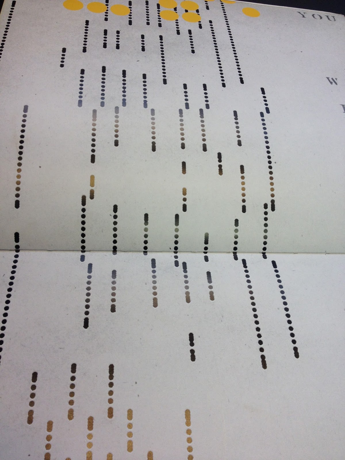
We decided to go to the library and find some books relating to Russian design. We were hoping to find some imagery with some noise or distortion. Below are the examples we found. The first shows an example using some red. We also liked how the image was split into different sections, but decided not to use this image in the end as it was a bit too complex and would have detracted from the meaning behind the song itself.
Below is another image taken from one of the books in the library which illustrates frequency. This again was too complex to use for our vinyl cover design.
We both really loved this double page spread and felt that it clearly illustrated noise but in a more organised fashion and also not quite so complicated as some of the previous images we had found. I took several different photographs on my phone so that we could have a choice to work with.
We also loved this image as it made us thing of the duga-3 transmitter from birdseye view. We decided straight away that we would use this image for our final design.
When we transferred this image to the computer, we cropped out the yellow to enable us to be able to customise the circles and perhaps apply colour if we felt it was necessary.
We then experimented with combining all of the images we had found, applied distortion to some of them, and tried several combinations before we settled on the final idea.
It is obvious from this screenshot as well as the previous one, that there is a white border or background behind the shape in the top right corner. We made the decision that we should probably cut the shape out before applying it to any of our further designs, just to make it look a bit more professional and applicable.
Experimenting with our initial idea, we drew over some of the circles with a solid red. The idea seemed stronger than it did in reality, and once we had made this application we weren't happy with the outcome.
Sam and I then discussed how we could illustrate the fact that the song is split into four different sections. We thought that we could perhaps use the lines taken from one of our images and draw over them with a thicker stroke. We also didn't really like this outcome because it detracted from the rest of the design. It also felt a bit too busy will all of the noise overlay.
By removing the top layer and placing the shape in the bottom left corner it meant that the audience's attention is drawn to both the background image as well as the sphere in front. We also made sure that there was a focus on the four different points to represent the four sections of the song. We were feeling a lot happier at this stage of the development.
We had discussed the idea of incorporating some text in with the design to allow the outcome to be a combination of text and image, as we felt this would be the most effective. We decided to look on Dafont to try and find a suitable font to use, and came across Kremlin, which we both felt was an appropriate choice of typography.
To express the name 'duga-3' we played around with using the letter 'D' as well as '3' enlarged, but it detracted too much attention from the rest of the design.
We tried to see what the artwork would look like without one of the images, however it looked a little bit too minimal.
This is what the final vinyl cover looks like in context. I am really pleased with the outcome of this first brief. We may have spent slightly longer on the it than we were initially planning on doing, but I think it was worth it to reach this final design.
Brief 2: Poster Design
We were then asked to design a poster for a band called Odonis Odonis. Sam and I started by looking for their website to get a feel for their music. We were given all of the specifications and what needed to be on the poster, so we just had to think of a clever way of presenting all of the information to make it appealing to their fans. The format of this design is A3.
Brief:
"Create a poster from the e-mail below.
Hey new poster please.
ODONIS ODONIS
+ Guests
Weds 18th April
Kraak Gallery
www.ticketline.co.uk
www.seetickets.com
www.wegottickets.com
Piccadilly Records
Oh! please have Saint Coltrane as support.
Dimensions A3 (297 X 420mm)"
We had a look online and came across their website which is shown below. We also had a listen to some of their music. There seemed to be a lot going on in all of their tracks so we thought about how we might illustrate this on the poster.
Below are some layout designs for the poster. We each spent a couple of minutes jotting down some rough ideas before experimenting on the computer. This was quite a useful exercise, and we both came up with some similar ideas which was good. I quite liked the idea of placing their name in the centre of a circle in the middle of the poster, and Sam quite liked the idea of applying textures to the design somehow, so that it was in keeping with their website, and also offered a different aesthetic rather than having quite a flat, boring design.
I had an idea of using brown tape to create a distorted collage look. Mainly taking inspiration from DR.ME themselves, as they do a lot of collage based work. I decided to scrunch the tape up into a ball and then pull it out flat and stick it down to a piece of white paper. This allowed some of the tape to be worn off in the process and left quite striking blank spaces to fill with another layer or photograph perhaps.
Sam suggested using a photograph of the band in the background and perhaps carrying out the same process but instead of using plain paper, using their faces as the background.
After much experimentation, we decided to scan in one of the pages of tape and work with one of the ones which didn't have their faces in the background, as they weren't very visible anyway.
We used Dolce Vita (Heavy Bold) for the typography as we didn't want to come too far away from what they already use for their personal branding. We then drew out a circle and placed it in the centre of the page and reduced the opacity to allow the image to show through.
Using the mask tool we then decided to mask the pattern within the circle and we then applied a block colour to the background. We were both really happy with this outcome, especially when we applied the type to the centre of the circle.
Using rulers we then applied all of the necessary text to the poster and placed it accordingly until we were happy and felt as though the design was balanced.
This is the final outcome. We were both really pleased with this design. I feel as though this is a prime example of a piece of work which has been produced in a limited amount of time, but still ended up being a success. The time limit enabled us to take our initial ideas of using the typography in the centre of the sphere, and the texture in the background and apply it as quickly and efficiently as possible. I am now really looking forward to printing this out and seeing what it would look like if produced in the real world.
Brief 3: Self directed art piece
"Create a piece of work EACH to no brief and for no reason other than the process of creativity and artistic freedom. The only rules are it must be 2D physical object and must be 23 x 16 cm. Be brave."
For this brief I thought about creating a range of different things. During my time on art foundation I produced a piece of work which I am still really happy with today. I thought about having another go at something similar, just using black ink on white stock. However, once I had a go at it, I realised that I probably wasn't going to gain much from revisiting something which I feel I had already done quite well.
The photograph below is the piece that I completed on foundation. It was my interpretation of one of the installations we made as a group at the time. Unfortunately I haven't got a photograph of the installation.
I visited Venice earlier this year and took a photograph while I was there which has stuck in my mind ever since. There were so many different side streets it was like a maze! I came across this pathway with gradually narrowed towards the end.
At the moment I am feeling quite overwhelmed with the amount of work I have to do. I keep having to remind myself that there is no point in worrying because it won't help, and if anything there are more important things to worry about.
I feel as though this photograph has the potential to illustrate how I am feeling, to almost suggest that there is a light at the end of the tunnel and a reward for all of the hard work we are all doing at the moment.
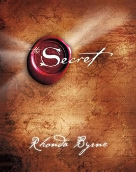
Before coming to Leeds College of Art, I worked for two years, but before that I studied philosophy. The way I think about things and the way I approach briefs, is often quite deep and has a lot of thought behind it. One of the books which I always refer back to is The Secret. I find it quite inspiring and there are a lot of relevant quotes inside which often give me a positive boost. For this brief therefore, I have decided to find a quote inside this book and apply it to the photograph in some way.
I don't like it when people simply grab a photograph off the internet and place typography all over it, then try and label it as being inspirational and a piece of art. This is why I am not going to focus on the aesthetic of the type for this brief, as I want the main focus to be on the photograph, with the quote simply acting as a supporting explanation.
Below are all of the different layouts/experiments with quotes and type:
Final two:
I feel as though the two designs below are the most appropriate to use. I quite like the image in black and white as well as colour, so I may print one copy of each and then decide which one to use as the final outcome.
As a further experiment, I wanted to see what it would look like if I was to take inspiration from some of DR.ME's work and apply a collage effect. I quite like it, however it distorts the image too much and doesn't make it as clear as I would like it to be.
Overall, I am really pleased with the outcomes of today's brief. I really enjoyed working on a live brief for the day as opposed to one I have written myself. It gave me a chance to switch off from all of the other work I am currently completing and also pushed me out of my comfort zone, as I don't often design much for the music industry.
No comments:
Post a Comment