Briony had asked me a while ago whether I would be able to design her business cards for her degree show at De Montfort University. I of course said that I would be more than happy to do her business cards for her, and also asked whether she would like me to design packaging for the bowls which are going to be exhibited. She said that would be wonderful if I had the time. I decided that I was definitely going to design some packaging as well as some additional materials if I have the time.
Briony sent some photographs of her pottery via email and asked whether I could apply them in some way to the work I am producing for her. I absolutely love the colours on her work and it was a refreshing change to be supplied with images to work with and in some ways produce an outcome which has certain restrictions.


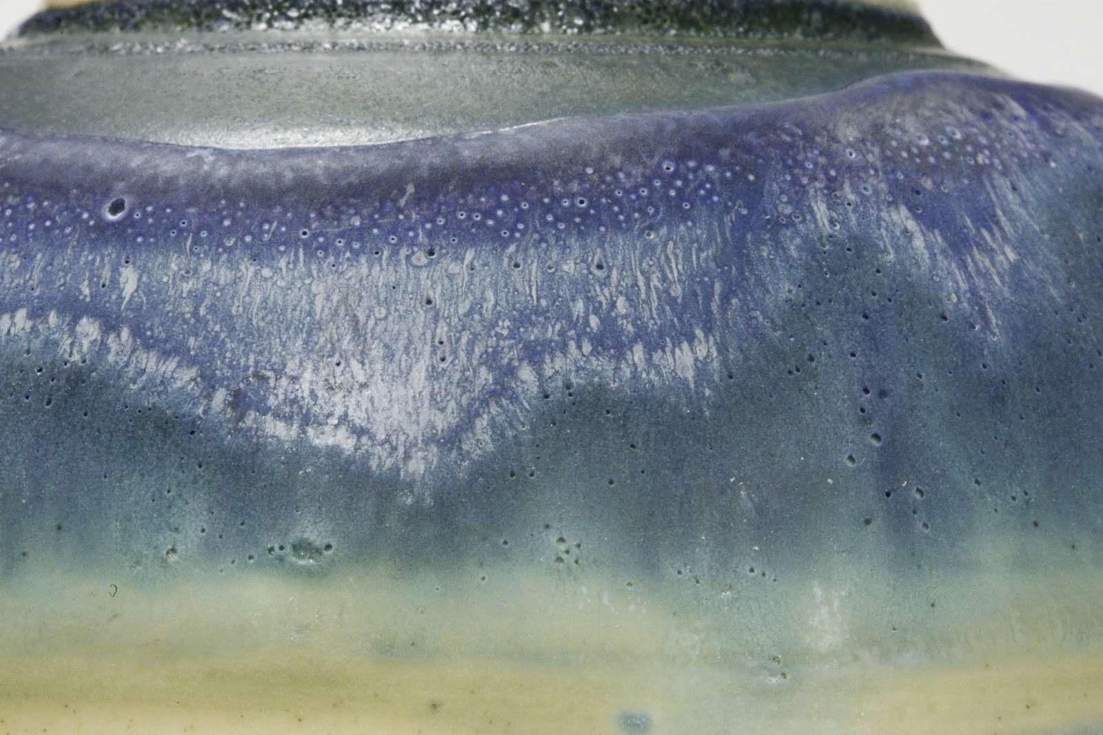


Briony also sent me some photographs of some ink drawings she had done. She also asked whether I could experiment with these because they are going to be up on the wall behind all of her work and may help to tie everything together.

When discussing logo ideas with Briony, I asked whether she would mind sending me a photograph of her name written in her hand writing. This is to add a personal touch to the final design, as I was already aware that she had lovely handwriting which would only compliment her work.


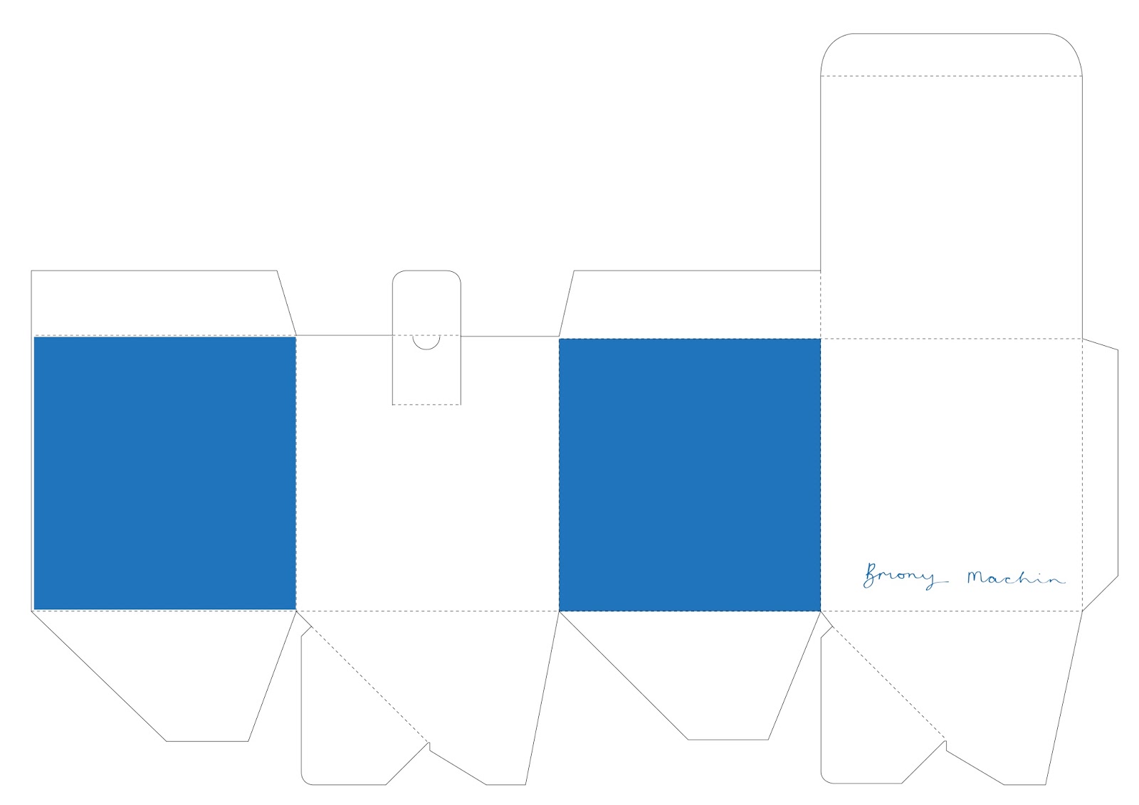
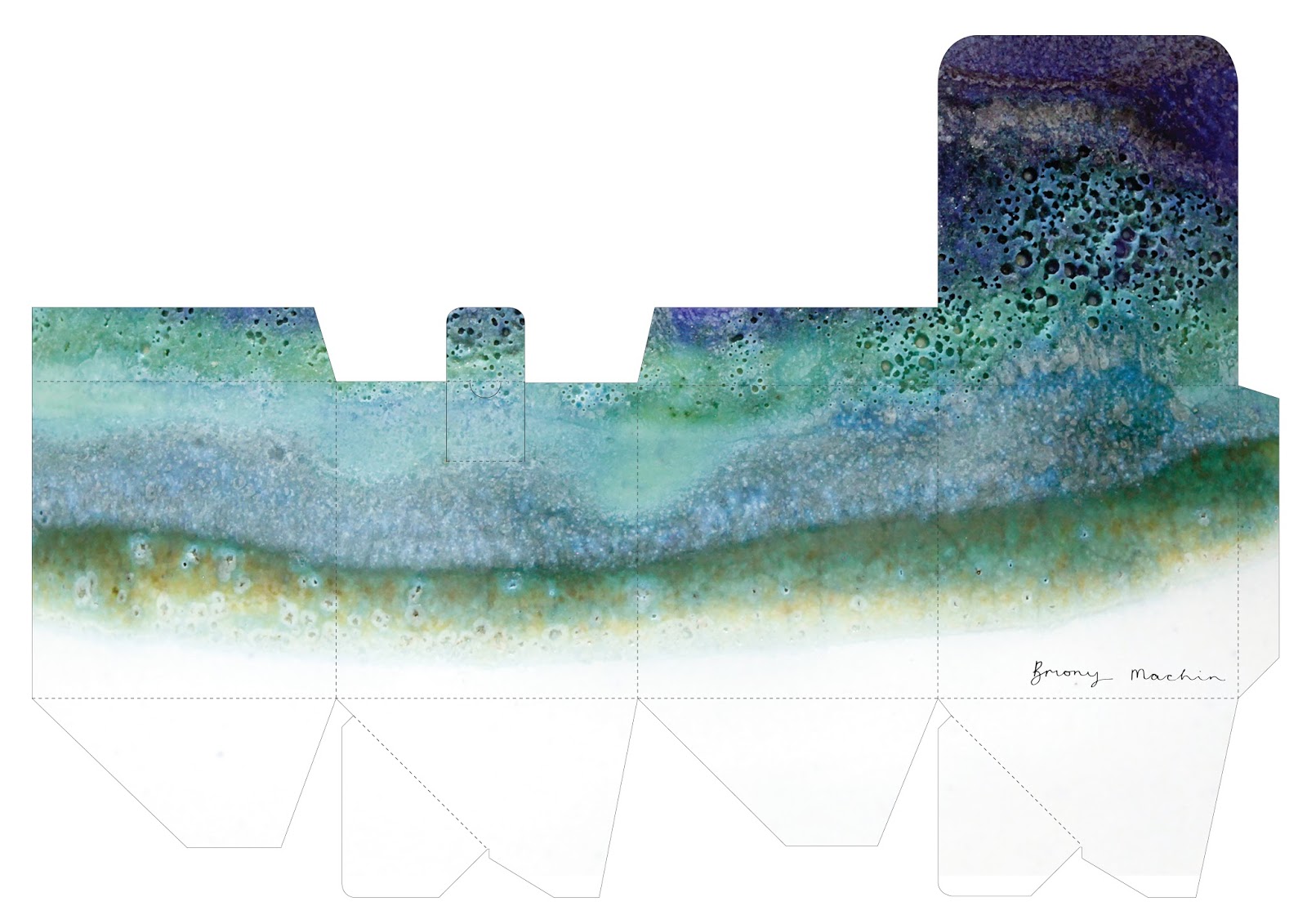
I applied one of the photographs to a miniature box mock up. Although I absolutely loved it I was slightly concerned that when it is blown up, it may not be clear enough and may be a bit pixelated. This is when I asked her to send me some images at a higher resolution. These photographs are also within the photographs posted above, and were much more successful when applied to the business card and box.


Unfortunately when the ink drawings were applied, they too were a bit too blurry. I was too worried about the final outcome not being crisp enough and had to explain this to Briony. She really didn't mind and said that I should go ahead and experiment further with the photographs and said she trusted my judgement.

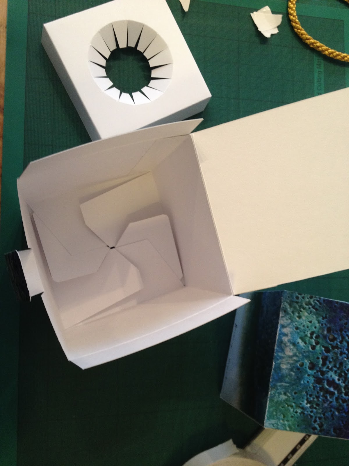
This is what the insert of the box looks like. It has been designed like this so that it can slot in and sit in the box for the bowl to be protected. This added extra feature just makes the whole outcome more realistic.


This is an example of application to a business cards using one of the patterns. It wasn't very successful though, because when I edited the photo in Photoshop, the edges blurred too much and it didn't look very realistic.


Step by step example
This step by step set of photographs was sent to Briony so that she could see how it works and how people would interact with it. She was really pleased and happy to send it to be printed.


Final Production
This is what the final production of the boxes looks like. I am really pleased with the print quality and can't wait to show Briony the final result.


Once the box had been finalised as well as the business cards. I decided to design an artist card to give a bit more information about Briony. Applying the same pattern to the front, these cards were first of all designed using two different sizes of typography, and one had a heading on it. The heading portrays what her collection is about and where the concept came from.
Final Files
Below are images of the final outcomes for the box, business card and artist card. I have also asked LGP whether they will be able to print out some stickers for me so that I can wrap the bowls up and seal them with a sticker before placing them inside the box.


No comments:
Post a Comment